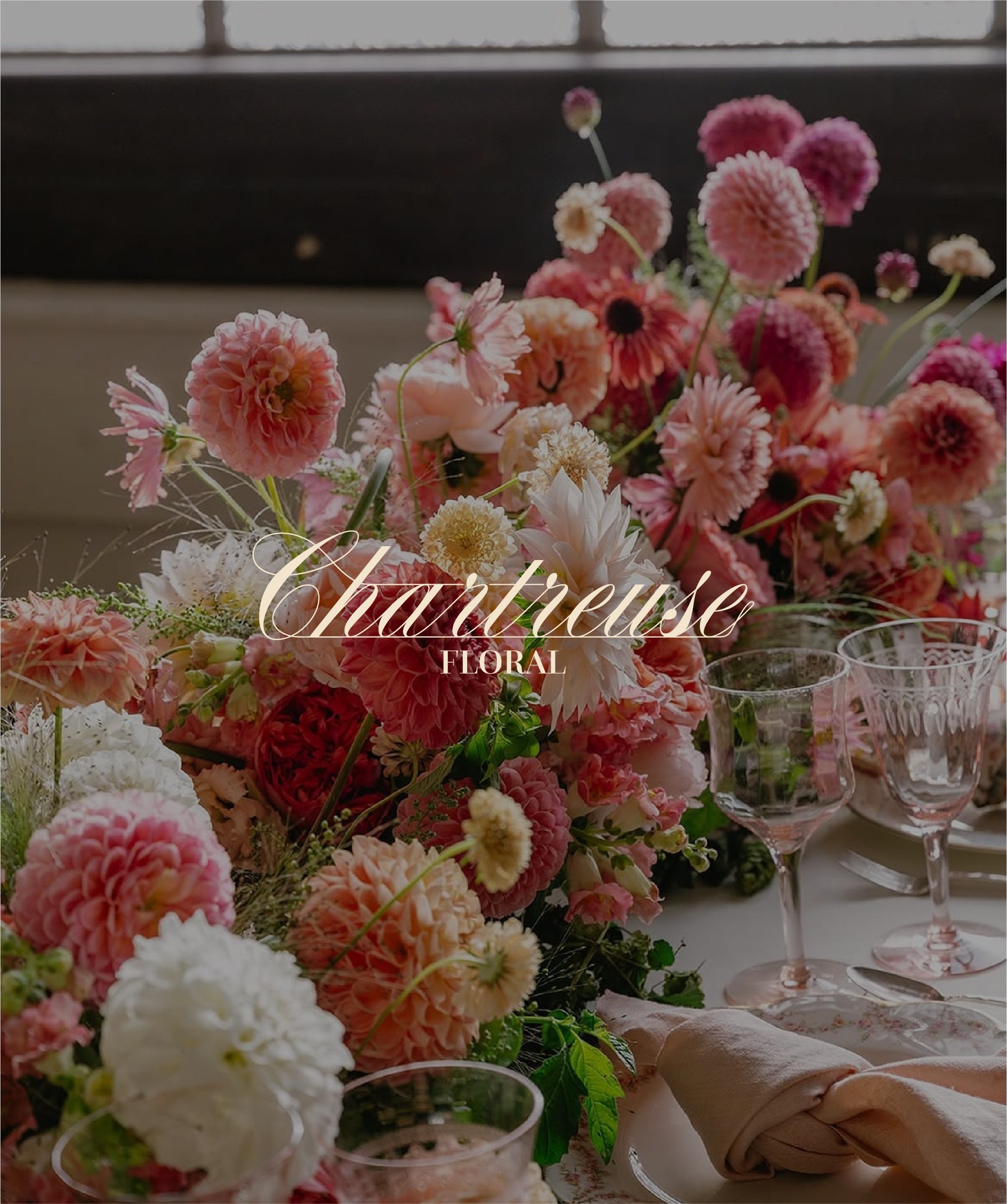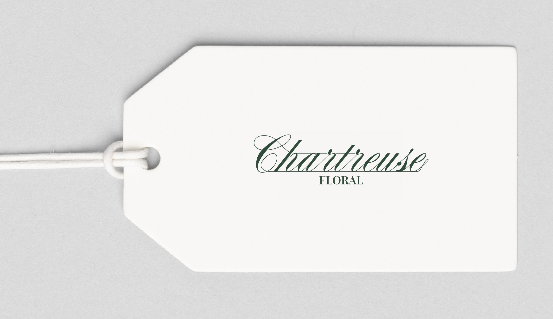
Chartreuse Floral
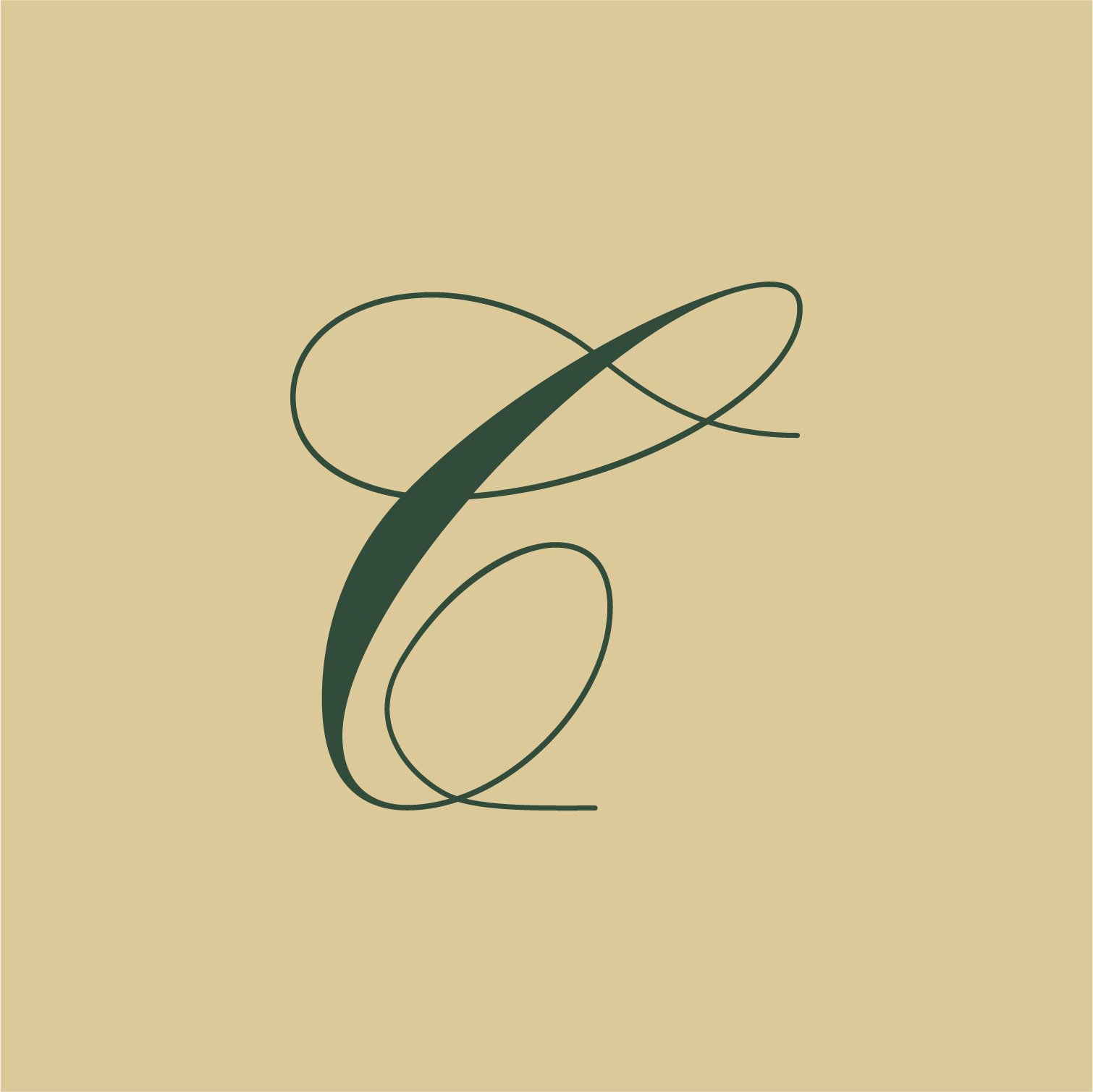
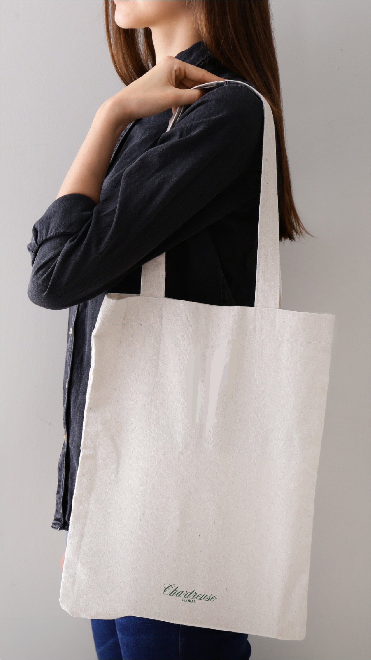
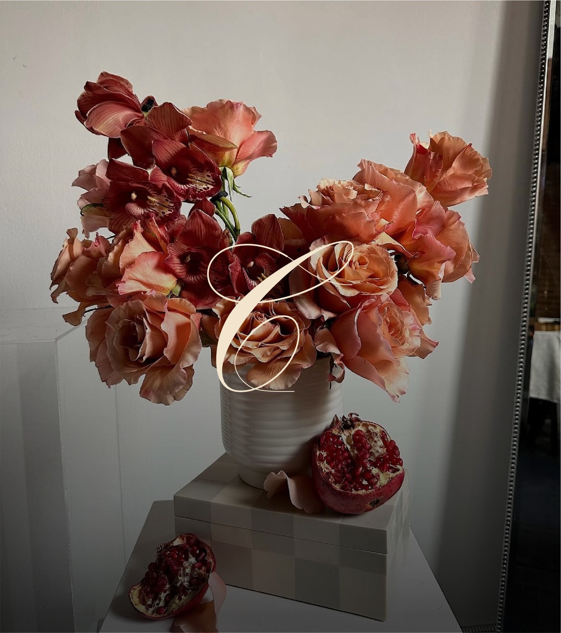
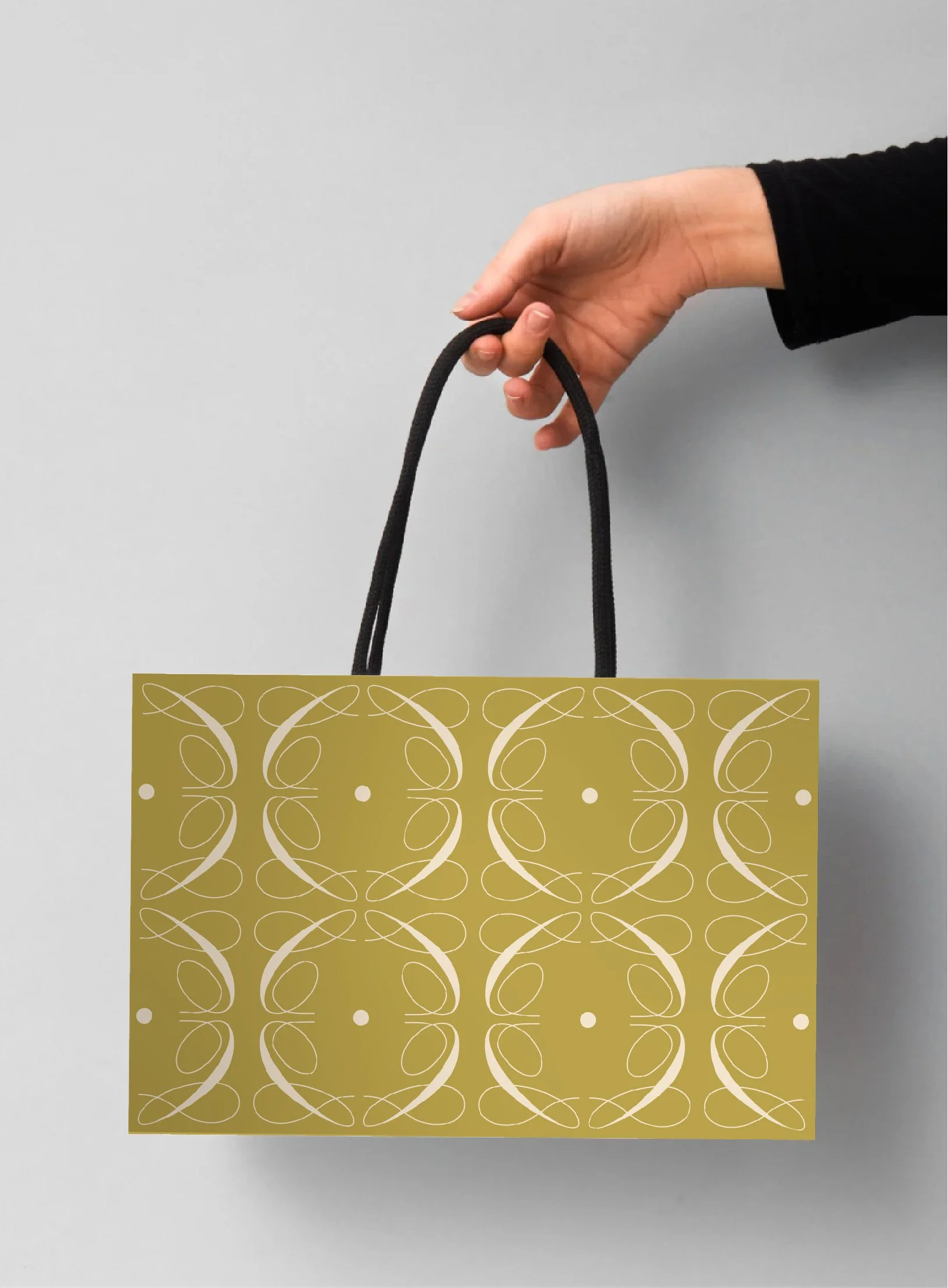
Chartreuse Floral is a luxury florist based in the U.S. that approached me to create a brand identity that beautifully blends traditional floral elegance with a modern, playful twist. She selected the core branding package, with a focus on crafting a sophisticated yet vibrant colour palette—featuring the signature shade of chartreuse, of course. The highlight of the visual identity is a bespoke repeat pattern, where a clever rotation and reflection of the letter ‘C’ forms a stylised floral motif. This pattern became a key brand element, designed to be applied seamlessly across packaging, including gift bags, thank you cards, and floral wrapping, adding a distinctive and elevated touch to the customer experience.Branding Package: The Core One